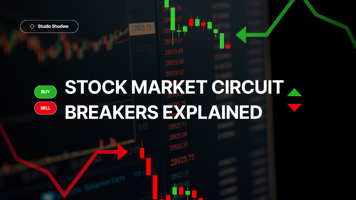
A candlestick chart packs four data points — the open, high, low, and close for a given period — into a single visual shape, which is why it's become the default chart type for anyone practicing technical analysis. Each candle tells a small story about the tug-of-war between buyers and sellers during that stretch of time, whether that's one minute or one month.
Anatomy of a Single Candle
The thick part of the candle, called the body, spans the opening and closing price. If the close is higher than the open, the body is typically shown in green or white and is called a bullish candle; if the close is lower, it's shown in red or black and called bearish. The thin lines extending above and below the body, called wicks or shadows, mark the highest and lowest prices reached during that period, even if the price didn't close there.
A long body signals strong conviction in one direction, while a small body with long wicks — sometimes called a doji or spinning top — signals indecision, since the price moved a lot during the period but ended up close to where it started.
Common Candlestick Patterns
Individual candles and short sequences of them form named patterns that traders watch for, though it's worth remembering these patterns are descriptive labels for common shapes, not guarantees of what happens next.
The table below covers the patterns cited most often in technical analysis education, split by the signal they're conventionally associated with.
Commonly cited bullish vs. bearish candlestick patterns
| Pattern | Typical Signal | What It Looks Like |
|---|---|---|
| Hammer | Bullish reversal (after a downtrend) | Small body near the top, long lower wick |
| Bullish Engulfing | Bullish reversal | A large green candle fully covers the prior red candle's body |
| Morning Star | Bullish reversal | Three candles: long red, small-bodied middle, long green |
| Shooting Star | Bearish reversal (after an uptrend) | Small body near the bottom, long upper wick |
| Bearish Engulfing | Bearish reversal | A large red candle fully covers the prior green candle's body |
| Evening Star | Bearish reversal | Three candles: long green, small-bodied middle, long red |
| Doji | Indecision, possible reversal | Open and close nearly identical, longer wicks either side |
Where Candlesticks Fit With the Rest of the Chart
Candlestick patterns are rarely used alone. Traders typically check whether a pattern forms near an established support or resistance level, whether it aligns with the prevailing trend line, and whether trading volume confirms the move — a bullish engulfing candle on unusually heavy volume is treated very differently than the same shape on a quiet, low-volume day.
Where Candlestick Reading Goes Wrong
The biggest mistake beginners make is treating a single candle pattern as a standalone buy or sell signal. Candlestick patterns are more accurately described as a starting point for further questions than a finished conclusion, and their reliability is a genuinely contested subject even among experienced technical traders. Backtests of individual patterns in isolation often show inconsistent results across different markets and time periods, which is exactly why professionals lean on confirmation from other tools before acting on any single shape.
Key Takeaways
- A candlestick shows open, high, low, and close for a period in one compact shape.
- Green or white bodies typically mean the close was higher than the open; red or black bodies mean the opposite.
- Long wicks signal price rejection at extremes; small bodies with long wicks signal indecision.
- Named patterns like hammer, engulfing, and doji are widely cited but are not reliable as standalone signals.
- Context — nearby support/resistance, the prevailing trend, and volume — matters more than the pattern shape alone.
- Treat candlestick patterns as a prompt to look closer, not a finished trading decision.
Frequently Asked Questions
What is the most reliable candlestick pattern?
No single pattern is consistently reliable across all conditions. Engulfing patterns and hammers/shooting stars are the most widely cited, but their success rate varies significantly depending on where they form and whether volume confirms the move.
What does a doji candle mean?
A doji shows the open and close price landing almost at the same level despite price moving during the period, signaling indecision between buyers and sellers. It often precedes a reversal but sometimes simply precedes more sideways movement.
How many candles should I look at to judge a trend?
A single candle rarely tells you much on its own. Most traders look at a sequence of candles alongside the broader trend line and support/resistance levels to build a fuller picture before drawing any conclusion.
Are candlestick charts better than line charts?
Candlestick charts show more information per period — open, high, low, and close — versus a line chart's single closing price. That extra detail is useful for technical analysis but isn't inherently 'better' for someone just tracking a long-term trend.
Conclusion
Candlestick charts are the most information-dense way to look at short-term price action, and learning to read the common shapes is a genuinely useful skill for anyone practicing technical analysis. The mistake to avoid is treating any single candle or pattern as a self-contained signal — the shape only becomes meaningful once you check it against the surrounding trend, nearby price levels, and volume.